
Below are a few examples of brands that have reached another level in creating and ensuring their website is user-friendly and easy to understand.
Dribbble
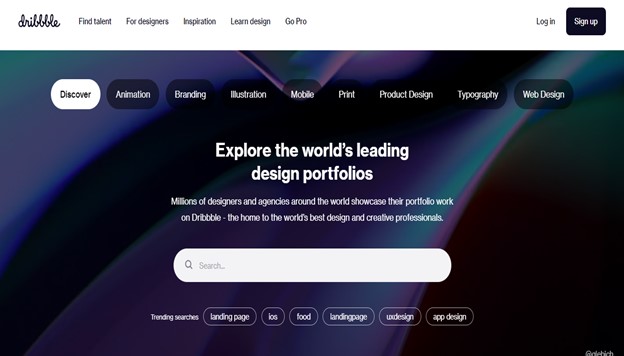
Dribbble2, a design platform, is an excellent example of a responsive website that showcases the flexible grid principle. This layout allows web designers to adjust the columns of content according to the device on which it is viewed, resulting in an improved browsing experience.
The view from a 13-inch laptop gives you a wider and perfect vision of how much the browsing experience is being enhanced and how it strikes an ideal balance between visibility and showcasing portfolio items.
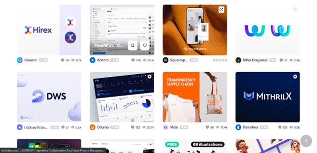
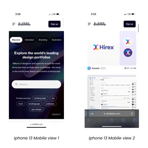
In comparison, when viewing on an iPhone 13 3 with a 6-inch screen, the grid is condensed to a single column.
How does this integration help your business?
Browsing on Etsy4 is a breeze thanks to its personalized approach, which helps customers quickly find the products they’re looking for. The brand’s flexibility makes the whole experience easy and enjoyable.
Let us have a look at Etsy’s website on three different devices.
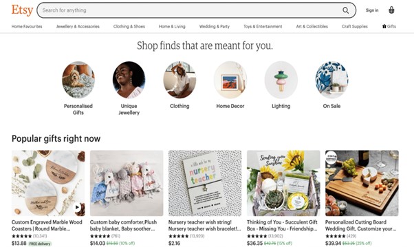
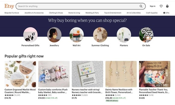
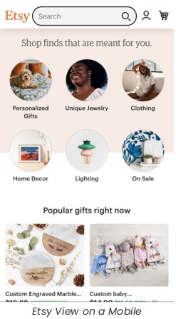
There’s not much difference between the laptop and tablet versions, but there are significant changes in the mobile version. You can see that the brand is making a way out by helping its customers get what they want at a better speed.
Dropbox
The website of Dropbox5 showcases how responsive UX design can significantly impact user behavior across various screen sizes. It goes beyond standard responsive design by presenting what appear to be entirely distinct web pages depending on the device being used.
The landing page for smartphones, tablets, and desktop screens are each displayed in three different versions.
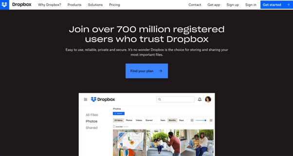
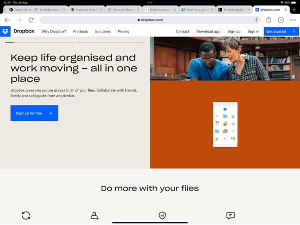
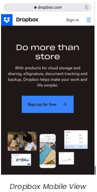
Dropbox uses a fluid grid system for navigation on desktop and tablet versions, with a hamburger menu for mobile. The primary call-to-action differs between devices, indicating varied user intent. They include high-res images in the mobile header. Conducting surveys can help tailor the design and copy for each device.
Takeaway
Responsive web design has become a fundamental requirement for modern websites. It enables a seamless user experience across different devices, enhances SEO rankings, reduces costs, and ensures your site stays relevant in a constantly evolving digital landscape. By embracing responsive design, you can secure the future of your website and distinguish yourself from competitors. This will not only enable you to leave a lasting impression on your visitors but also help you achieve your online objectives. So, if you haven’t already, it is time to transition to responsive web design and stay ahead in the ever-competitive online world.
V2Solutions, a trusted Digital Transformation partner, is dedicated to helping you create disruptive content to capture your audience’s attention and set you apart from the competition. Our knowledge of the latest and most significant trends ensures your brand stays ahead of the curve. Let’s get together and unlock your brand’s full potential.
Sources
1 – www.google.com
2 – dribbble.com
3 – www.apple.com/in/shop/buy-iphone/iphone-13
4 – www.etsy.com
5 – www.dropbox.com